Components

A short, floating message that gives the user some non-critical, extra context.
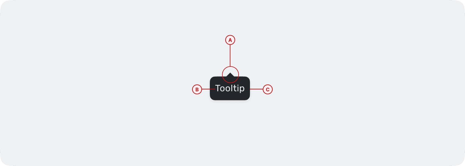
Anatomy
A tooltip consists of a container (C) that holds the text (B), providing context or clarification, and a pointer (A) that visually connects it to the trigger element.
Types
There are 8 container types, and the pointer position anchors dynamically based on the content and placement context.

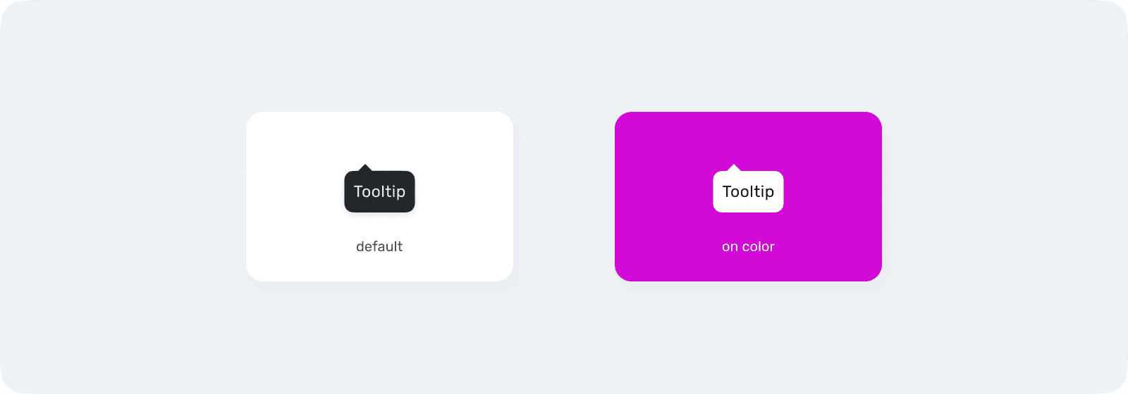
Color
Use on-color only when the tooltip appears over a primary brand background. In all other cases, use Default for optimal readability.
Clarity
Tooltips should be short, focused, and instantly scannable.

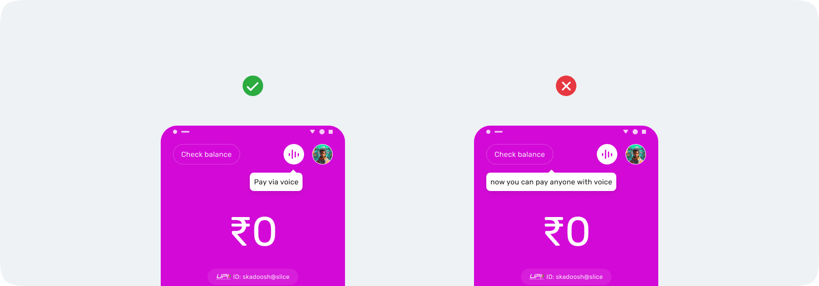
Alignment
The tooltip caret must visually connect to the trigger element.
Clutter
Only one tooltip should be visible at a time.

Obstruction
Tooltips should never block interactive elements.
